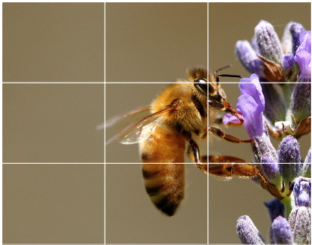
The Rule of Thirds consists of dividing an image into 9 sections using two horizontal and two vertical lines. Then, essentially filling each of the 3 regions created with a different point of interest. Following this layout, you create a more visually stimulating image.
Everyone's eye takes in light the same way (unless you happen to be an owl). While we are viewing something we are drawn to a focal point between our peripheral vision. While it is not always noticeable, when images are designed without applying the rule of thirds, it can leave the viewer with a natural aversion to the graphic.
 When designing your graphics for an advertisement make sure to apply the rule of thirds. The extra time spent in creatively laying out your marketing materials will pay off on the back end. When an image catches someone's eye it leaves a much longer impression. Furthermore, they are more likely to actually read your offer and positively associate with it.
By: Will Pearlman


